The project started with a website. But the website first needed an identity.
The situation
Margreet came to We Lead looking for a website that could professionally present her work to galleries, potential collectors and commission clients. The project quickly became more than a website engagement.
She had a distinctive body of work and a clear creative perspective, but no logo, brand system or centralised digital portfolio. Before designing the website, we first needed to determine how her identity should look, feel and function around the art.
Her digital presence was limited to lightly maintained Instagram and Facebook profiles. There was no single destination where someone could understand her background, explore her paintings and sculptural work, review earlier collections, or contact her about a commission. Social media could show individual posts, but not the full range of her work with the structure and credibility of a dedicated portfolio.
Margreet described the website she wanted as both minimalist and bold. Those ideas can easily conflict. A minimal interface can feel too quiet for an expressive artist, while a heavily styled website can compete with the work it is supposed to showcase.
She also works across several disciplines: portraiture, mixed-media painting and wearable sculptural art. The website needed to hold all of that together without making her practice feel fragmented.
The system stays quiet. The work speaks.
Let the system stay quiet
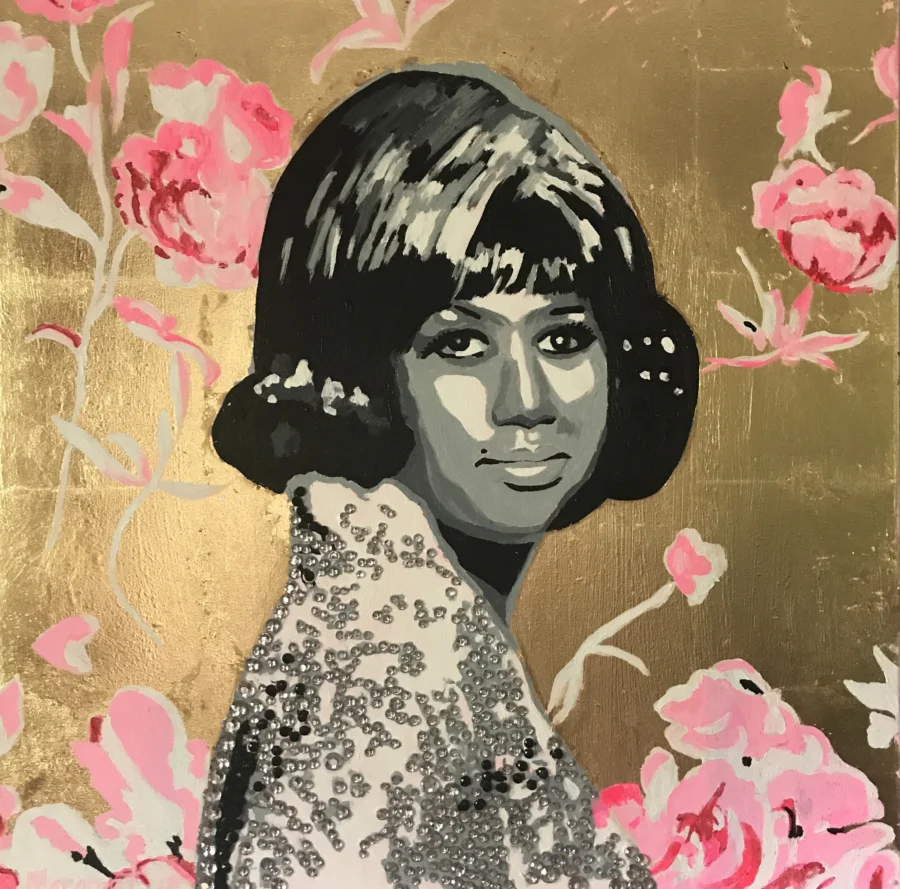
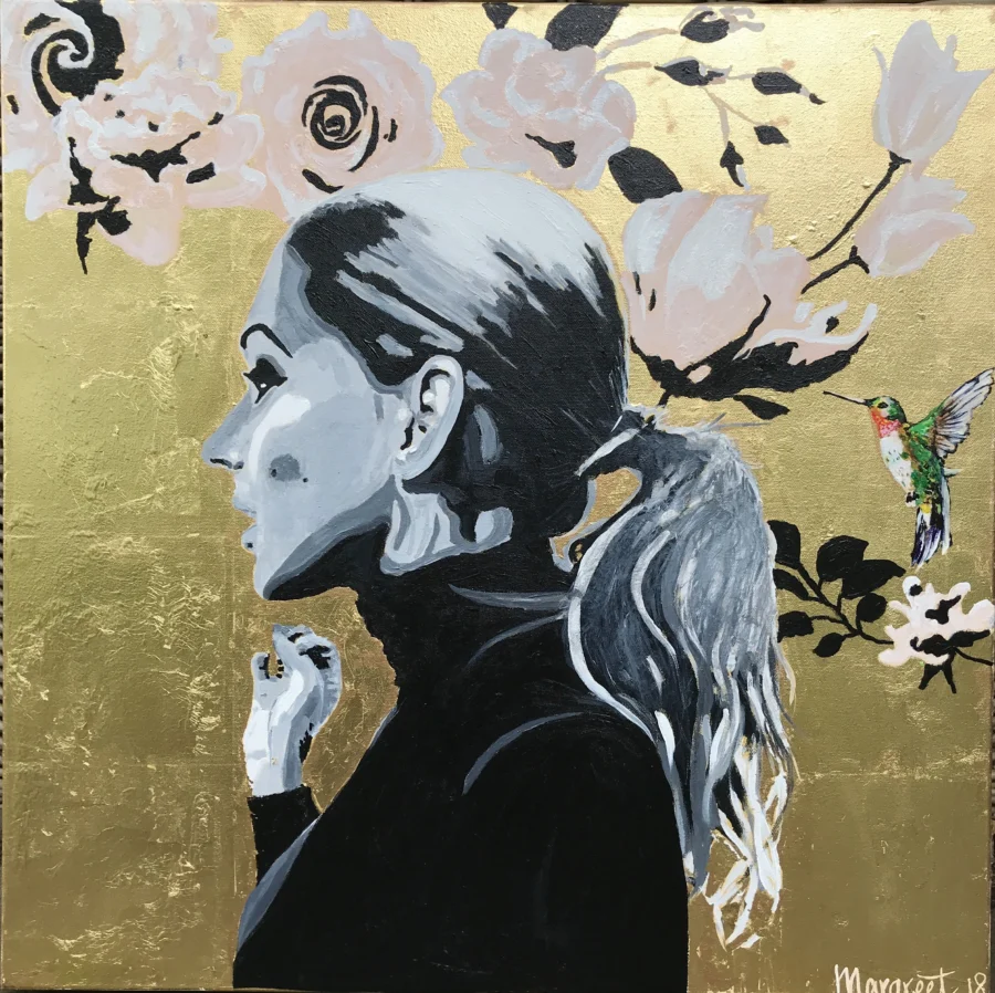
Instead of making every part of the brand bold, we assigned different roles to the artwork and the interface. The artwork provides the colour, texture, energy and movement. The surrounding system provides structure, whitespace, readability and consistency.
Neutral backgrounds, controlled typography and minimal interface elements create space around each piece rather than competing for attention.
An identity that was already hers
Margreet did not need a manufactured symbol or a generic gallery monogram. She was already signing her artwork in a personal and distinctive way.
We explored several versions of her handwritten signature before selecting the raw mark exactly as she naturally wrote it. It was not cleaned into perfect geometry or replaced with a script typeface. Its irregularities were part of what made it authentic.
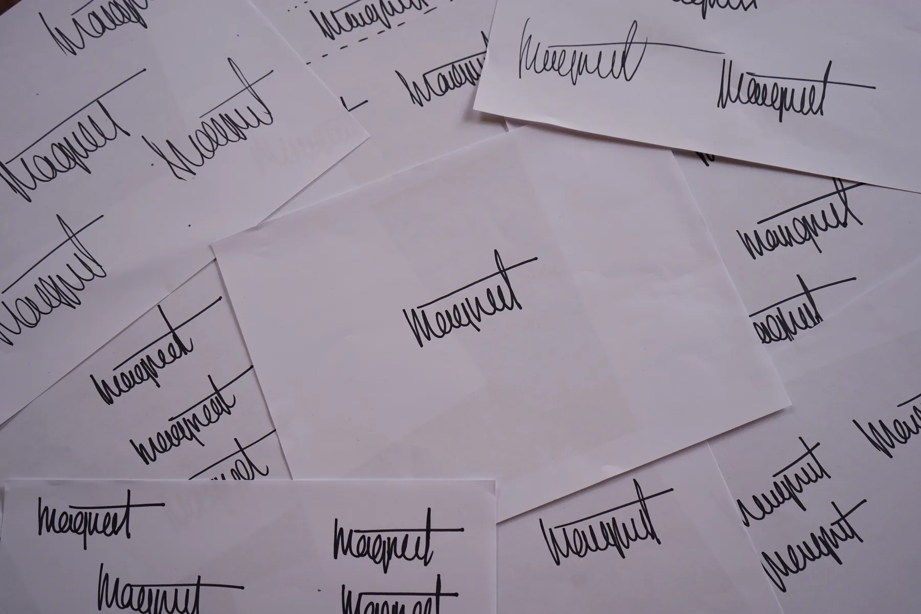
Signature exploration: dozens of variations written by hand, on paper.
The selected mark, kept raw, with its irregularities intact.
Applied as the logo in the website navigation.
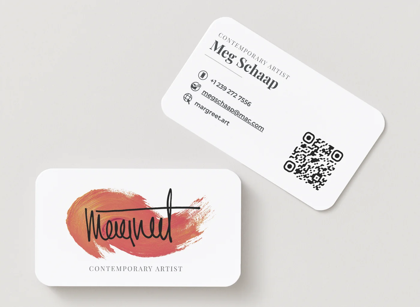
Applied to the business card, over a single brushstroke.
A restrained visual system
Playfair Display introduces an editorial and artistic quality appropriate for Margreet’s work, while Helvetica keeps navigation, descriptions, labels and practical information clear and accessible. Neither typeface attempts to become the focus.
The neutral palette is interrupted only by selective coral-orange and golden accents. Orange brings warmth, movement and creative energy to primary interactions. Gold introduces a quieter sense of craft, material richness and refinement. Used sparingly, the colours guide visitors without overwhelming the work.
Display
Playfair Display
Editorial, artistic. Headlines and artwork titles.
Interface
Helvetica
Navigation, labels, descriptions, practical information.
Accents
Coral for primary interactions. Gold for craft and material richness. Both used sparingly.
Organising a multidisciplinary portfolio
The website needed to do more than display attractive images. It needed to make Margreet’s full practice understandable.
We developed separate experiences for her paintings and her wearable dress sculptures, supported by an artist biography, statement, earlier artwork archive, commission information, contact form and frequently asked questions.
Recent paintings are presented separately from earlier collections, so visitors can see what Margreet is creating now while still exploring how the work developed. The painting archive is further organised into categories such as portraits, icons and musicians. The result is a portfolio that feels curated rather than simply uploaded.
Writing the story around the work
We structured and drafted the website copy in collaboration with Margreet, who reviewed and refined the content before publication. The writing needed to give galleries, collectors and commission clients enough context without overexplaining the artwork.
Showing the artist behind the art
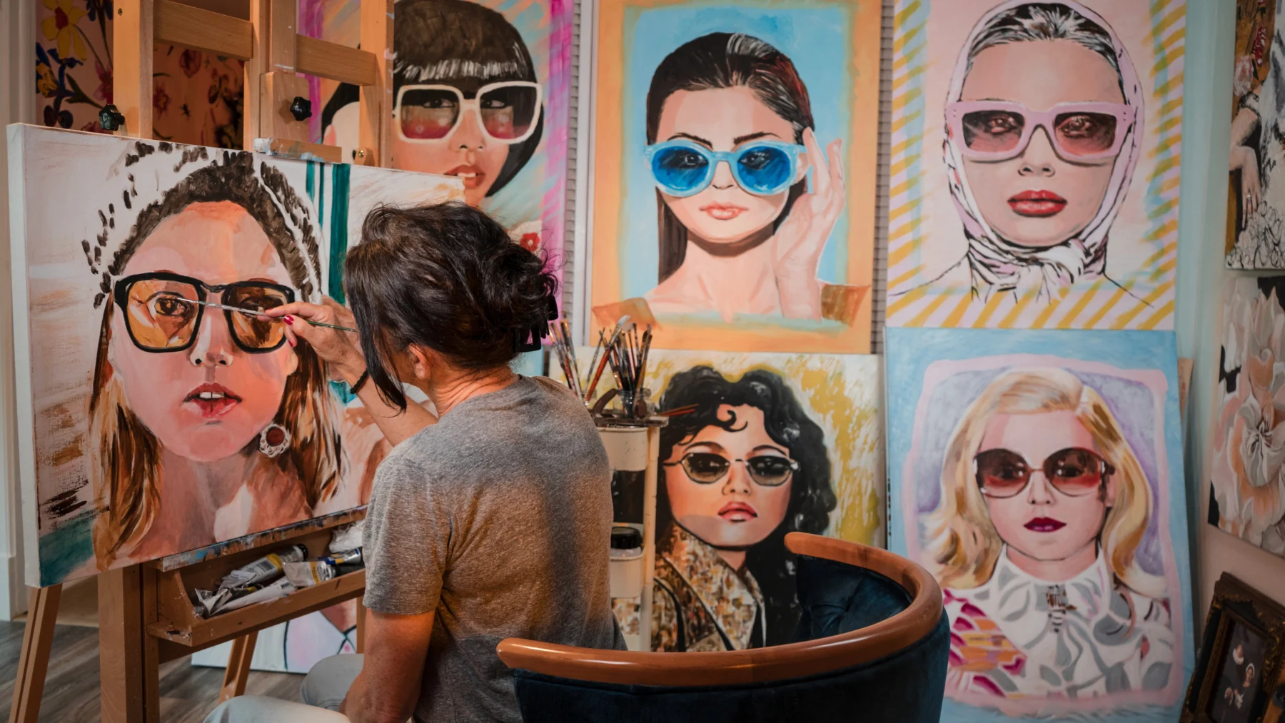
A generic portrait would not have communicated enough about Margreet or the way she works. We planned and photographed her inside her own creative space, surrounded by paintings, materials and works in progress. This let the homepage introduce her through the act of creating, rather than presenting her separately from her work.
Still to come: contextual artwork presentations: paintings placed inside selected interior settings so collectors can judge scale and atmosphere. These are digitally created visualisations, not photographs of real installations, and will be labelled as such. This system will be applied across the painting portfolio.
The outcome
Margreet now has a cohesive identity and a professional digital portfolio built around the work itself. The website gives her a single destination to share with galleries, collectors and commission clients. Her paintings and sculptural work are separated clearly without feeling disconnected, and new pieces can be added as the portfolio develops.
The finished system extends beyond the website through her business card, original photography and the ongoing presentation of her artwork in context.
- One professional destination for gallery applications.
- Clear presentation across several artistic disciplines.
- A portfolio system designed to grow with new work.
The most important outcome is not that the brand changed how her work looks. It gave the work a clearer way to be seen.
The right brand does not always need to say more.
Sometimes it needs to create enough clarity and space for the work to speak for itself.